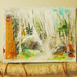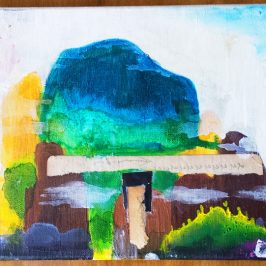
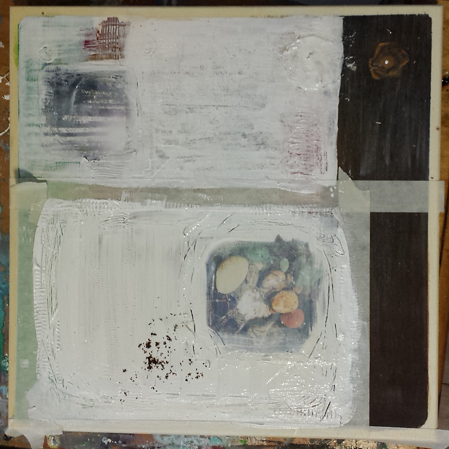
Painting 9, as it turns out, was originally painting 2. I just did not like it and have been trying to salvage it this entire time. I didn’t like how it almost looked like a flag, with the horizontal colour stripes. I didn’t like how the featured image was not really a landscape. It felt like the kind of interior design photo you would put up in your powder room, but not what I was going for with this series.
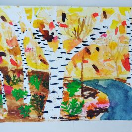
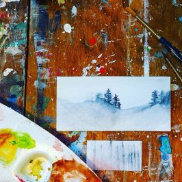
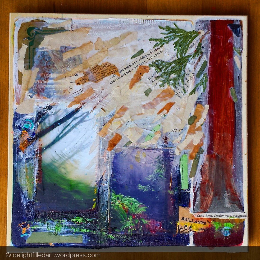
Just look at how hard I tried:

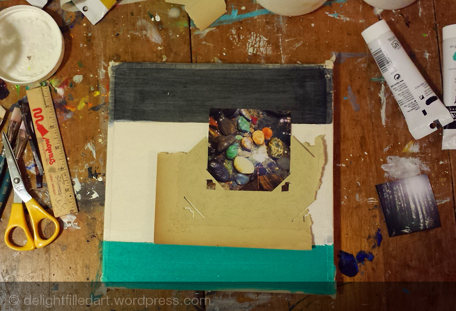

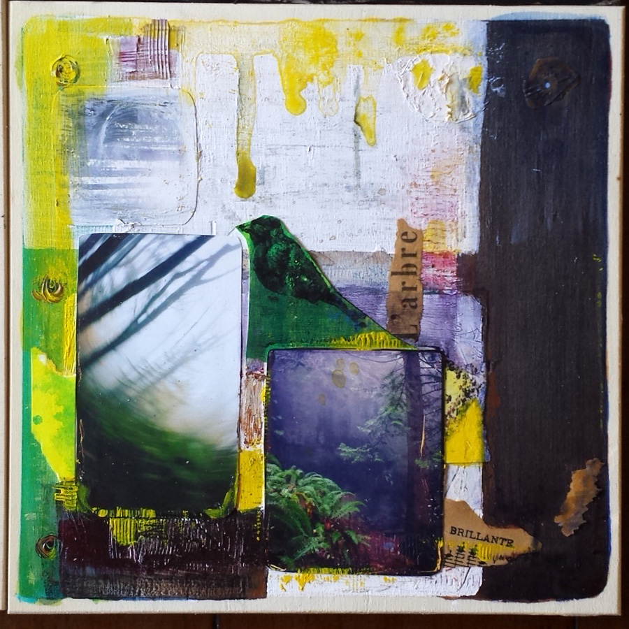
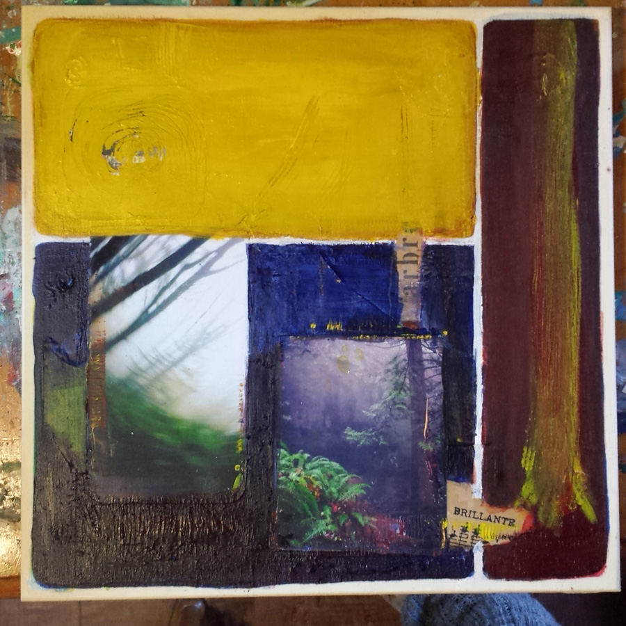
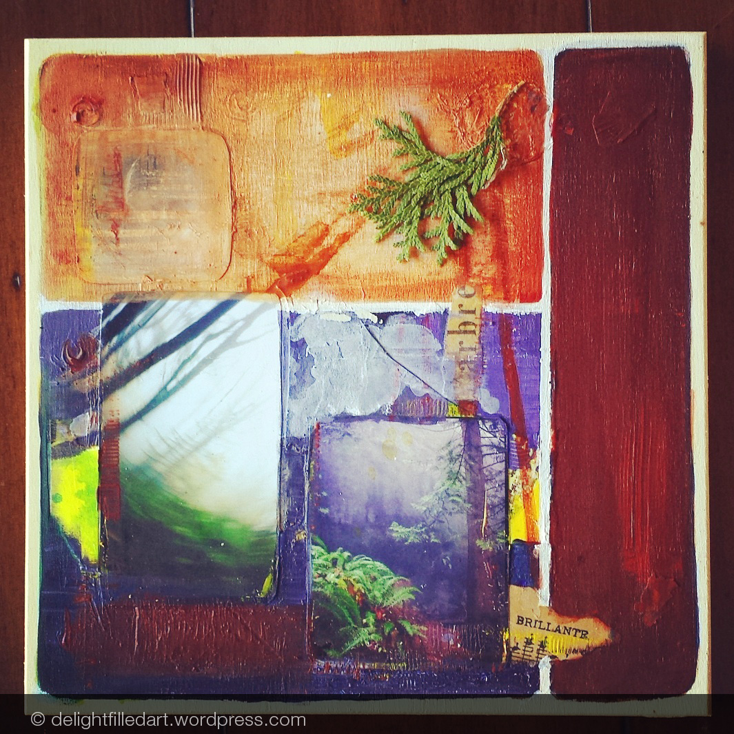
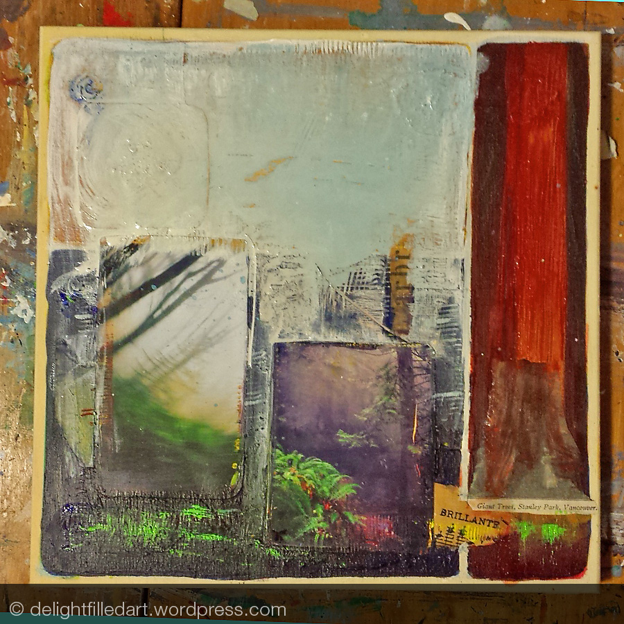
I liked the two images and how the composition moved along from the green in one photo to the green in the other. I like that I took these photos while hiking with the baby on one of my favourite trails nearby. So while this wasn’t working out, I decided to just finish it anyway and celebrate the sense of how large the cedar trees are here on the west coast. I found a neat image in my Grandma Jean’s 1910 school book of a big cedar tree in Stanley Park, so I used that at the base of the tree. I’m not sure what I’ll do with this painting–laundry room??–but here it is.